Dark mode email

Here you can find out why dark mode emails are important and how to plan to build your next email template with dark mode in mind.

At EmailGeek I only create dark mode friendly emails because the effort vs reward is not as important as your customer choice.

If you was looking for a dark mode emails in next 24 hours call me to find out more on: 07478606656

20+ Emails Templates Here

dark mode email

Why are dark mode email important?

Respecting your subscribers choice is important.

As email marketers we do not have many way to see who using dark mode email on there devices.

And if we do have this metrics we need to ensure customers are always getting the best experience.

Why to build & design dark mode emails

Accessibility friendly

Email nowadays should be built for everyone, this include people who might have minor or a major disabilities.

Dark mode does not make it disability friendly but it can help, for dyslexic people and other with ADHD, I struggle with dyslexia and (dark mode email / coded editors) really help me.

Between 5-10% of the global population experience dyslexia and a recent study has shown the global rate of ADHD is at 5% of the population.

People personal choice

Yes I have touch on this already, but it is an important point, if you chosen dark mode and you have receiving bright emails.

Your likly to unsubscribe at worse or not engage with this email that the marketer has work hard to create.

According to Litmus 43% of subscribers prefer dark mode emails, even know this does not look like the best stat to shout home about its important to know these bright emails are not everybody cupa cuppa.

Honour brand integrity

If you are a bigger brand, you know how important your customers communication is, by not designing or attempting to try honour the subscribers preference for dark mode emails it will look bad on the brand.

Looking at the previous stats 43% of people that could lose trust in your brand, also 10% minimum of people need dark mode to help them read or engage with emails.

So with this in mind how much integrity does the top brand have? I know in the UK these brands (GoCompare, Racing Post, Boat International) put subscribers first as I built a lot of there emails.

Honour brand design

Design within email it more important then websites or banner ads, this is because of a few factors, We are all trained to flag a spam or bad looking email.

Everything from Barclays bank telling us to be careful of emails to training at work and school nowadays.

Undesigned dark mode email can look poor so subscribers may belive it a spam email or just like a normal email but very bright if you choosen dark mode. As the world wakes up to dark mode friendly emails do you want to be the one left behind or looking like spam?
Preparing to build dark mode emails

Picking your color pallet:

When I build dark mode emails I try to think about subscribers first, brand second, how easy it is to maintain third.

I try to pick three to four core background colors, this way I keep the CSS smaller and can keep re-using classes to stlye background color elements of my dark emails.

The background color I choose when preparing dark mode emails are dark themed but not to dark, to be able to blend the content sections.

dark mode black background color

This black I use to breakout content areas, by starting with your darkest colors on the outside we can lighten up the email on the main content.

core background color

This medium grey is one of the core background colors for GoCompare dark mode emails, with splash of color worked well see the next section.

core background color 1

This light grey is one of the background colors I use for text content, this separation of contect can help layout sections.

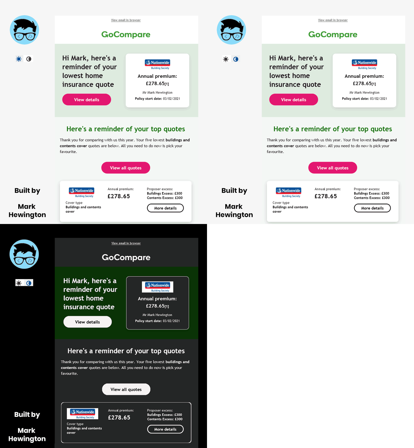
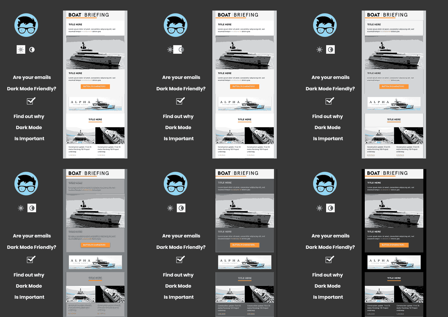
check out this interactive image  showing dark mode friend custom email templates made for GoCompare

Dark mode images

Here is a dark mode version I build for GoCompares price emails back in January 2021.

Notice of the top logo it changes from green to white on dark mode, this is a neat CSS trick from a litmus blog, but its only one of the methods we use when planning back email dark mode image.

The other image here for (nationwide building society) has a white background and it is a (jpg) rather than a (png) with a transparent background.

Here we could not optimise full for dark mode as we had api images pulling from source, but we made 95% of the design look great.

Litmus
dark Mode client

Email Client NameDark Mode CSS
Apple Mail 13 Dark - Apple Mail 13 Dark SomeTimes
Apple Mail 14 Dark - macOS 11.0 SomeTimes
OL Office 365 Dark - Win 10 NO
OL Office 365 Dark - macOS 10.5 NO
Gmail App Dark - Android 10.0 SomeTimes
Gmail App Dark - iOS 14.2 SomeTimes
iPhone 11 Pro Dark - iOS 13.1 YES
iPhone 11 Dark - iOS 14.2 YES
iPhone 12 mini Dark - iOS 14.2 YES
iPhone 12 Dark - iOS 14.2 YES
iPhone 12 Pro Max Dark - iOS 14.2 YES
iPhone Beta (Dark)- iOS 15.0 Beta YES
iPad (Gen 7) Dark - iOS 13.1 YES
Outlook.com Dark - Chrome YES
Outlook.com Dark - Firefox YES

Email on acid
dark mode client

Email Client NameDark Mode CSS
iPhone XR - iOS 14 Dark Mode YES
iPhone 11 - iOs 14 Dark Mode YES
Apple Mail 12 - macOS Mojave Dark Mode NO
Apple Mail 13 - macOS Catalina NO
Apple Mail 13 - macOS Catalina Dark Mode NO
Outlook Office 365 - macOs Catalina Dark Mode NO
Outlook Office 365 - Windows 10 - Dark Mode NO
Chrome - Windows 10 YES
Edge - Windows 10 YES
Firefox - Windows 10 YES

Litmus - But what to note is they has more emails clients to show renders but are more expensive.

Email on Acid - They are cheaper but might need Litmus to do a full test, but EOA have a dark mode tracking px

Some time comment I vague but text, background color, img - css work for. but other elements can not work for so having defualts really helps.

Contact me if you need any help

If you need advice or a dark mode email building contact me to see if I can help, I look forward to your feed back.